Aurora Borealis Flow
Live previewPerformance varies by device
No account needed to copy or download. Check dependencies and thelicense status before publishing.
<!DOCTYPE html>
<html lang="en">
<head>
    <meta charset="UTF-8">
    <meta name="viewport" content="width=device-width, initial-scale=1.0">
    <title>Aurora Borealis Flow</title>
    <style>
        :root {
            /* Configuration Colors */
            --bg-color: #020111;
            --aurora-1: #00ffcc;
            --aurora-2: #0066ff;
            --aurora-3: #9900ff;
            --animation-speed: 20s;
        }
        body {
            margin: 0;
            overflow: hidden;
            background-color: var(--bg-color);
            background-image: radial-gradient(circle at 50% 10%, rgba(2, 1, 17, 1) 0%, rgba(0, 0, 0, 1) 100%);
            display: flex;
            justify-content: center;
            align-items: center;
            height: 100vh;
        }
        .stars {
            position: absolute;
            top: 0;
            left: 0;
            right: 0;
            bottom: 0;
            background-image:
                radial-gradient(2px 2px at 20px 30px, #eee, rgba(0, 0, 0, 0)),
                radial-gradient(2px 2px at 40px 70px, #fff, rgba(0, 0, 0, 0)),
                radial-gradient(2px 2px at 50px 160px, #ddd, rgba(0, 0, 0, 0)),
                radial-gradient(2px 2px at 90px 40px, #fff, rgba(0, 0, 0, 0)),
                radial-gradient(2px 2px at 130px 80px, #fff, rgba(0, 0, 0, 0)),
                radial-gradient(2px 2px at 160px 120px, #ddd, rgba(0, 0, 0, 0));
            background-repeat: repeat;
            background-size: 200px 200px;
            opacity: 0.3;
        }
        .aurora-container {
            position: absolute;
            top: 0;
            left: 0;
            width: 100%;
            height: 100%;
            overflow: hidden;
            filter: blur(60px);
            opacity: 0.7;
            transform: translateZ(0);
            /* Hardware acceleration */
        }
        .aurora-blob {
            position: absolute;
            border-radius: 50%;
            animation: flow var(--animation-speed) infinite alternate ease-in-out;
            mix-blend-mode: screen;
        }
        .blob-1 {
            width: 80vw;
            height: 60vh;
            background: var(--aurora-1);
            top: -20vh;
            left: -10vw;
            transform-origin: center right;
            animation-duration: calc(var(--animation-speed) * 0.8);
        }
        .blob-2 {
            width: 70vw;
            height: 70vh;
            background: var(--aurora-2);
            top: 10vh;
            right: -20vw;
            transform-origin: center left;
            animation-duration: calc(var(--animation-speed) * 1.2);
            animation-delay: -5s;
        }
        .blob-3 {
            width: 90vw;
            height: 50vh;
            background: var(--aurora-3);
            bottom: -10vh;
            left: 20vw;
            transform-origin: top center;
            animation-duration: var(--animation-speed);
            animation-delay: -10s;
        }
        @keyframes flow {
            0% {
                transform: scale(1) translate(0px, 0px) rotate(0deg);
            }
            33% {
                transform: scale(1.2) translate(50px, -50px) rotate(10deg);
            }
            66% {
                transform: scale(0.9) translate(-50px, 50px) rotate(-5deg);
            }
            100% {
                transform: scale(1.1) translate(20px, -20px) rotate(5deg);
            }
        }
        @media (prefers-reduced-motion: reduce) {
            .aurora-blob { animation: none; }
        }
    </style>
</head>
<body>
    <div class="stars"></div>
    <div class="aurora-container">
        <div class="aurora-blob blob-1"></div>
        <div class="aurora-blob blob-2"></div>
        <div class="aurora-blob blob-3"></div>
    </div>
</body>
</html>About this animation
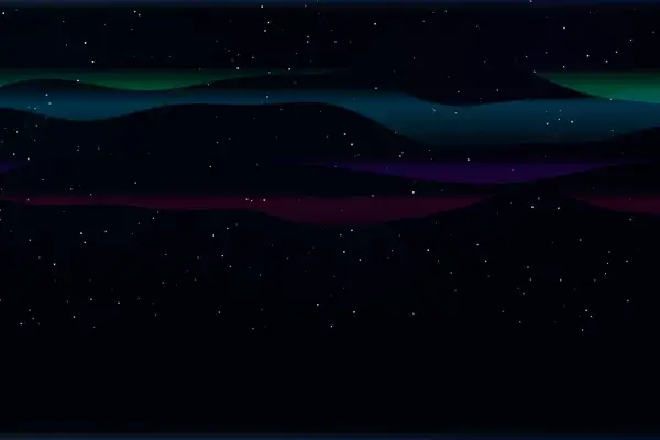
Three blurred CSS colour blobs in teal, blue and violet drift and blend behind a static starfield, simulating flowing northern lights.
Under the hood
Blurred CSS Aurora Blobs
Pure CSS with no canvas or animation script: three oversized
.aurora-blob divs in teal #00ffcc, blue #0066ff and violet #9900ff sit inside a container with filter: blur(60px) and mix-blend-mode: screen, so their colours bleed together into aurora curtains. Each blob loops the same @keyframes flow animation of scale, translate and rotate at a different duration derived from --animation-speed: 20s (16s, 24s and 20s, with -5s and -10s delays on two of them), while a repeating tiled radial-gradient starfield sits static behind them.Related